Learn how to mix and match plates and silverware for an eclectic tablescape
The women in your life (your mother and grandmother) may have taught you the dishes and silverware on your table must be the same pattern; everything matches. Well, that was then, this is now.
An eclectic blending of dinnerware and silverware creates a picturesque and sometimes playful tabletop. It won’t be bland or boring, that’s for sure.
How to mix and match dishes and silverware?
Sort through your existing tableware and separate according to category. Stoneware, which is casual, goes into one pile and the porcelain and refined china goes in another. Do not mix the china with the stoneware and vice versa. That is NOT good mixing and matching.
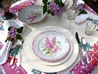
Look at the assortment. What do you have? Can you discover a pattern? Are there floral motifs? Stripes? Checks? Geometric designs?
Let’s begin. Put a floral dinner plate with a striped salad bowl. Stack them. How does that look? Florals and stripes balance one another. Florals are mellifluous while stripes are bold.
Your goal is to establish a continuous leitmotif of some kind, which can be achieved through color and patterns.
Can you see an echoing design in the plates? Perhaps there is dark green on all the dishes. The green may appear in a leaf on one plate and as a stripe or polka dot on others. This color, green, is your associating theme. It creates the pattern. It is your leitmotif or theme.
If your plates feature diverse floral patterns they may be challenging to mix but it can be done. They must share something, such as a color or floral pattern. When putting disparate yet somewhat similar designs (florals) together pick a color that appears in all the dinnerware. This creates a connective sequence and prevents the final outcome from being hectic.
Another way to create a harmonious mix is by finding a pattern in the type of flowers displayed on the plates rather than relying on a color. For example, combine plates featuring roses.
Think about color and what goes well together. Complementary hues are also called contrasting colors and include, for example, red and purple or green and yellow. On the color wheel, these colors are exactly across from one another. When using complementary hues together it makes the colors stand out more intensely.
Consider combining dinnerware featuring cool colors (blues and greens) or do likewise with those in warm shades (reds and oranges.)
You can fuse various plates and saucers successfully as long as you ultimately achieve a sense of balance and orderliness in the arrangement. It doesn’t look messy but intentional and purposeful. There is a pattern. It may be hard to detect at first but it’s there. Many consider this look ‘shabby chic.’
Your objective is to set a beautiful table achieved through compelling formation using pattern and color. You want your table settings to be pleasurable and they will be although you may have to practice your mixing and matching skills for a while.
Keep in mind, the joy of this is everyone gets a different place setting. Nothing is the same yet it is cohensive and harmonious.
Silverware
You can mix gold and silver utensils (flatware, silverware) although this was probably a no-no in your mother’s and grandmother’s day. This adds sparkle to the table but don’t go overboard. If you want to accentuate the silverware rather than the dishes use neutral colored plates and saucers.
Keep in mind, when setting a table, the tablecloth should not compete with the tabletop display. It is the background and should enhance and not distract or compete with the dishes. The same goes for napkins.
Mixing patterns, if done correctly, ends up in a lovely table display but if you go hog-wild it will look like a discordant cacophony of mismatched items.