Choosing great fabrics for quilting depends on design, texture and color palette
One of the best parts, if not THE best part, of quilting is choosing great fabrics for quilting. The materials you select distinguish your work from that of others. It reveals your personality, color affinities and creative style.
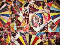
The sky’s the limit when it comes to picking fabrics. There is fabric for children, babies and teens, cotton knit fabric, Lycra and flannel, to name a few.
Best Fabric
Quilting aficionados recommend you choose 100 percent cotton material because it is not slippery, it maintains a crease and handles well.
Color
We know you are like a kid in a candy store when confronted with all the choices. What to choose?
Skillled quilters know about color value. This refers to how dark or light a hue is in relation to the colors surrounding it. Quilters determine how to assemble patches of fabric based on color value and whether they want the patches to contrast or merge with one another.
~
Before you start quilting, collect your material swatches and place them side by side. Play around with them. Move them. See what combination of colors and prints you like the best. You may be surprised how changing up the positioning of swatches dramatically alters the look.
Another consideration is color warmth. Warm colors include yellows, reds and oranges. Cool colors are blues and green. Warm colors stand out whereas cool hues tend to recede. If you are unfamiliar with colors, get a color wheel and study it. You will learn about contrasting and complementary colors and a lot of other information that helps in designing quilts.
In time, as you become more experienced working with colors, you realize a medium green fabric placed next to a white swatch results in the green appearing dark; however, if you place the same medium green next to a very dark blue swatch, the green becomes a medium rather than dark hue.
Prints and Florals
Working with large prints and florals is a bit more difficult because depending on where you cut the floral or large print swatch it is going to look different. If you cut in one area, you end up with a dark colored swatch. If you had cut the piece elsewhere it looks light.
Materials should harmonize with one another. For instance, if you select a large scale plaid for the focal point, the surrounding fabrics should be smaller plaids or prints to they won’t vie for attention with the focal point print. Additionally, if, for example, there are reds, blues and greens in your big print, the smaller print fabrics should contain at least some of the same colors.
A quilt is more interesting, visually, when it consists of large and small scale print. If only small prints are used, when looked at from a distance the quilt appears to be one solid color.
Mix materials. Some quilters love to combine flannel and cotton. Be creative and use your imagination.
For those who don’t yet trust their color/design judgment, choose fabrics from one collection. The manufacturer selects print scales and various colors that go together so this takes the guesswork out of choosing compatible designs and colors.
Pre-wash?
Some quilters recommend washing, drying and pressing the fabric before using or storing; however, other quilters do not like to pre-wash the fabric. Why? There may be shrinkage. Bleeding is not a big issue because the dyes are completely set. Manufacturers realize a lot of quilters do not pre-wash so the dye it set.
When pre-washed, the fabric can lose its sizing, which when present establishes a nice, crisp material, making it easy to cut and piece the fabric. Washing removes the crispness.
Experiment and see which approach works best for you. There isn’t a right or wrong way.
Now get started. Happy quilting!